Adding Style and Sorting Details
Overview
You can add specific styling elements to the widgets and decide whether the metric values are sorted in ascending or descending order in the system.
These styling elements differ based on the visualization you have selected for the widget. Let us look into them one by one.
Styling Chart Widgets

Select Chart Type
Here, you can select multiple chart types which include the following:
- Area Chart
- Line Chart
- Horizontal Bar Chart
- Vertical Bar Chart
- Stacked Area Chart
- Stacked Line Chart
- Stacked Horizontal Bar Chart
- Stacked Vertical Bar Chart
You can chose any of these multiple chart types to specify how the chart will be visualized on the widget.
Chart Legend
You can enable/disable the display of chart legend on the widget using the Legend toggle button.
X-axis Title/Y-axis Title/Z-axis Title
You can display the x-axis, y-axis, and z-axis title on the chart widget by using the X-Axis Title, Y-Axis Title, and Z-Axis Title toggle button respectively. You can then enter the title of the respective axis in the field besides the toggle button.
Here, you can see that the x-axis title has been mentioned as Time and the y-axis title has been mentioned as Latency
Changing the angle of the X-Axis Title
You can change the angle of the X-Axis Title in case there are multiple points on the X-Axis and they are not clearly legible. Enter the angle of rotation in the Rotation field to change the angle of the X-Axis.
Changing Line Width
You can adjust the line width of the chart to control the thickness of the lines in your data visualization. A thicker line can make the data more prominent and easier to distinguish.
Adjust the slider titled Line Width to get the desired line width value. A higher value will result in thicker lines, while a lower value will make the lines thinner.
For line chart, you can also select the line style between Solid or Dash. If Dash type line is selected for line chart, it enables you to to select line spacing for your visualisation ease.
Adding Points in Chart
Selecting the Point toggle displays event pointers in the chart widget. Also, you can define the point size after turning the toggle button to ON.
Changing Data Granularity
Granularity refers to how data points are spaced on the chart widget, affecting the level of detail in your visualization. You can adjust the granularity to show data points at different intervals.
Enter a custom value of Granularity to define how far apart two data points are located on the chart.
The granularity ranges from 1 to 3600 in seconds and from 1 to 1440 in minutes. Also, the minimum granularity allowed is equal to the polling time for the specific metric of the device. If you enter a granularity value less than the polling time, it will automatically adjust to the polling time to ensure accurate representation of the data.
Adjusting the data granularity allows you to tailor the level of detail in your chart to meet your specific needs, ensuring that your data is presented in the most meaningful way for your analysis.
Adding Metric Grid
You can turn the toggle button ON for Metric Grid and select the metric options to be displayed under the chart view. You can select for the values like Avg, Min, Max, and/or Sum.
Sorting Data Points
You can sort data points on the widget to highlight specific information or trends based on the available fields. Choose one of the following sorting options:
| Option | Description |
|---|---|
| Top | Use this option to sort data points in descending order based on the highest values. This is helpful when you want to focus on the most critical data or the top performers. |
| Last | Select this option to sort data points such that the datapoints with the lowest values appear first. |
| Count | Specify the count of datapoints that you wish to view on the widget. |
Marking Chart Widgets
You can mark data points as per the required threshold values. Choose one of the following sorting options:
| Option | Description |
|---|---|
| Type | Use this option to select marker type. You can select between line type marker or range type marker from the drop-down. |
| Threshold | Select the threshold value or threshold range as required. |
| Color | Specify the color in which you want to view on the marker on widget. |
| Line Type | Specify the marker line type. You can select from dash, solid and solid bold. |
| Label | Specify the label for the label. |
Adding Timeline Preference
Timeline Preference allows you to choose between using the global dashboard timeline or setting a custom sticky timeline for this widgets. This enhances flexibility by enabling consistent, widget-specific time ranges that persist across dashboard views.
Enabling the Use Custom Sticky Timeline toggle button displays data based on its own selected timeline, overriding the global dashboard timeline on this widget.
Styling Grid Widgets

Changing the order of columns
Grid display uses the simple drag and drop method to arrange the order of the columns. Drag the columns from the Column Setting tab and drop them in the order you want to display on the widget.
Adding a value-key tag as a column in the grid
You can specify a tag to add as a column in the widget. Here you have the option to select key-value based tags as a column. Once you select a tag from the drop-down, those Tags will be available as column in column settings
Changing the column display name
You can change the column names in the widget. Enter the column name that you wish to display on the widget in the Display Name field of corresponding column under the Column Setting tab.
Hide a column on the widget
You can remove a column that you do not wish to display on the widget by hiding the column from the Column Setting tab. Click on the check box titled Hidden to hide the column on the widget.
Configure the columns in detail
Click on the Configure option against the corresponding column you wish to configure in the Column Setting tab. A pop-up to configure the column appears.

The available options in the configuration pop-up are as follows:
| Configuration Option | Description |
|---|---|
| Resizable | Use this toggle button to enable the resizing of the column width using drag and drop. |
| Sortable | Use this toggle button to enable the widget sorting using the values of the selected column. |
| Orderable | Use this toggle button to enable the option to change the order of the selected column using drag and drop. |
| Width(%) | Enter the width(in percentage) of the column as you want to display on the widget. |
| Add Color Configuration | Select this option to configure the color of the column on the widget based on fixed threshold values. |
| Add Value Configuration | Select this option to append a prefix/ suffix to the column value on the widget based on fixed threshold values. |
| Icon | Select a suitable icon that you wish to display with values of the column. |
| Icon Position | Select whether you want to display the icon selected in the previous option as a prefix or a suffix to the values in the column. |
Change the column header size
You can change the column header size from the Header Font Size dropdown under the Style tab.
Adding Timeline Preference
Timeline Preference allows you to choose between using the global dashboard timeline or setting a custom sticky timeline for this widgets. This enhances flexibility by enabling consistent, widget-specific time ranges that persist across dashboard views.
Enabling the Use Custom Sticky Timeline toggle button displays data based on its own selected timeline, overriding the global dashboard timeline on this widget.
Styling Top N Widgets

The styling properties for the Top N Widget are the same as the Chart widget. You can refer the Styling Chart Widget section above to learn more about the same.
Sorting Top N
You can sort Top N on the widget to highlight specific information or trends based on the Counter. Choose one of the following sorting options:
| Option | Description |
|---|---|
| Top | Use this option to sort data points in descending order based on the highest values. This is helpful when you want to focus on the most critical data or the top performers. |
| Last | Select this option to sort data points such that the datapoints with the lowest values appear first. |
| Count | Specify the count of datapoints that you wish to view on the widget. |
Adding Timeline Preference
Timeline Preference allows you to choose between using the global dashboard timeline or setting a custom sticky timeline for this widgets. This enhances flexibility by enabling consistent, widget-specific time ranges that persist across dashboard views.
Enabling the Use Custom Sticky Timeline toggle button displays data based on its own selected timeline, overriding the global dashboard timeline on this widget.
Styling Gauge Widgets
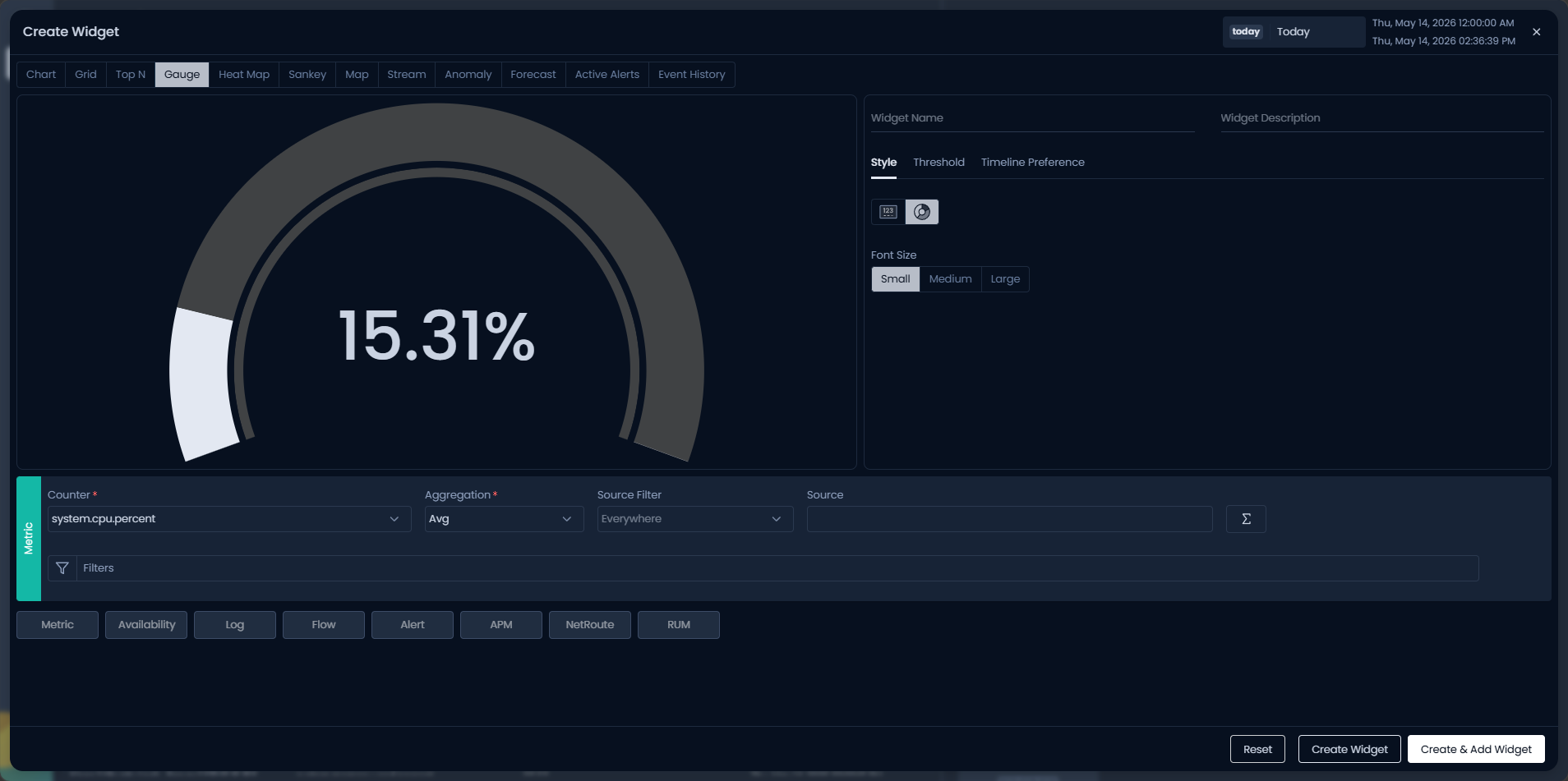
Select Gauge Type
You can select one of the following two options based on how you want the gauge to be displayed:
| Gauge Type | Description |
|---|---|
| Metro Tile | Select this option if you want to display the metric value on the widget tile. You can set Font Size, Text Alignment, Icon and its position, and Metric Trend Background color for widget visualization. |
| Solid Gauge | Select this option if you want to display the metric value on a solid relative scale. You can select Font Size for widget visualization. |
Setting Gauge Widget Thresholds
You can define thresholds for the gauge widget from the dedicated Threshold tab. These thresholds determine the color representation within the gauge widget based on the values of a metric. This color indication serves to communicate the severity or status of the metric based on the specified thresholds.
Adding Timeline Preference
Timeline Preference allows you to choose between using the global dashboard timeline or setting a custom sticky timeline for this widgets. This enhances flexibility by enabling consistent, widget-specific time ranges that persist across dashboard views.
Enabling the Use Custom Sticky Timeline toggle button displays data based on its own selected timeline, overriding the global dashboard timeline on this widget.
Styling Sankey Widgets

You have the flexibility to rearrange the components of the sankey chart for a personalized view. Drag and drop the tiles representing the components of the sankey chart under the Style tab to present them in the order that you prefer.
Adding Timeline Preference
Timeline Preference allows you to choose between using the global dashboard timeline or setting a custom sticky timeline for this widgets. This enhances flexibility by enabling consistent, widget-specific time ranges that persist across dashboard views.
Enabling the Use Custom Sticky Timeline toggle button displays data based on its own selected timeline, overriding the global dashboard timeline on this widget.
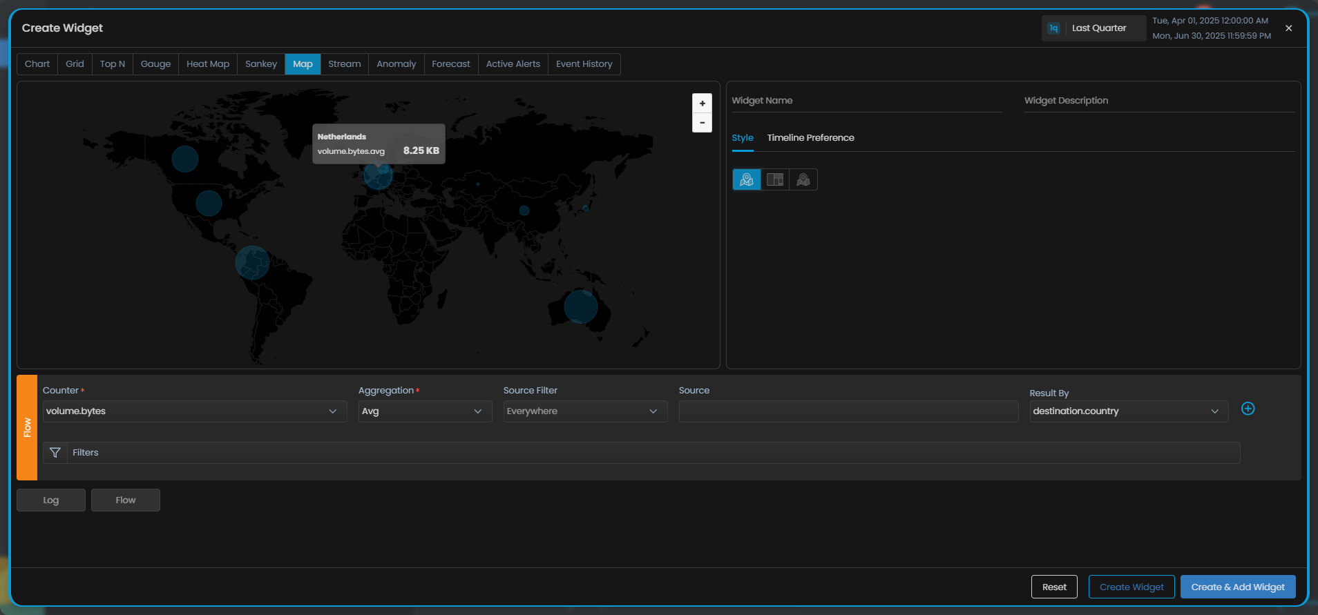
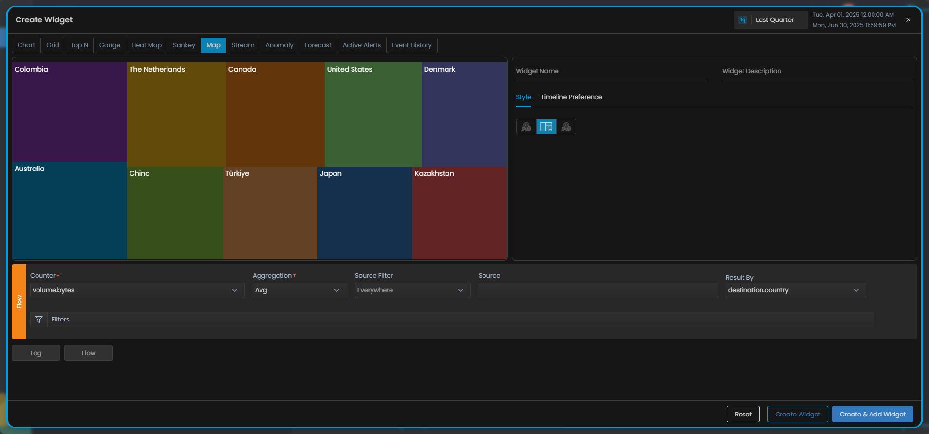
Styling Map Widgets

Select the visualisation for the map widget based on your preference from the Style tab from the following:
1. Map
Choose this option to visually trace the path of log and network flow transmissions from their source to a destination on the map.
2. Tree View
Choose this option to showcase the relative volume of log, flow or alert data for each country/city with respect to the total log or flow volume.
The size of each node in the map is proportional to its log or flow volume compared to the total data volume. This means that larger nodes on the tree have a higher volume of log or flow data, while smaller countries have a smaller share of the total data.
3. Bubble Chart
Select this option to visualize the volume of log or flow data across different countries or cities in comparison to one another.
Each bubble on the map represents a location, with its size corresponding to the volume of log or flow data. Larger bubbles indicate higher data volumes, while smaller bubbles represent lower volumes, offering a clear visual comparison of data distribution.
Adding Timeline Preference
Timeline Preference allows you to choose between using the global dashboard timeline or setting a custom sticky timeline for this widgets. This enhances flexibility by enabling consistent, widget-specific time ranges that persist across dashboard views.
Enabling the Use Custom Sticky Timeline toggle button displays data based on its own selected timeline, overriding the global dashboard timeline on this widget.
Styling Anomaly and Forecast Widgets
The styling properties for the Anomaly and Forecast Widgets are the same as the Chart widget. You can refer the Styling Chart Widget section above to learn more about the same.
Styling Event History Widgets
The styling properties for the Event History Widgets are the same as the Grid widgets. You can refer the Styling Grid Widget section above to learn more about the same.
Styling Text Widgets

You can adjust multiple parameters of text widget to make it suitable according to your dashboard and other visualizations. The available options are listed below:
| Configuration Option | Description |
|---|---|
| Text to Display | Enter the text you wish to get displayed on the label. |
| Font Size | You can either choose a font size from preset options or choose Auto. When text size is selected to 'Auto', the text size will change according to the size of the label. |
| Font Color | Choose a font color to highlight the text. Default color is white. |
| Text Align | Select an align option to align the text in that particular fashion to be displayed on the label. |